Global Justice Ecology Project

The Global Justice Ecology Project partners with Indigenous communities and grassroots groups across the Americas to tackle the root causes of environmental and social injustice. Through advocacy, research, and direct-action campaigns, GJEP drives systemic change while amplifying frontline voices for climate justice and human rights.

tools

Figma / Figjam

MY ROLE

UX Design
UI Design
Information Architecture

Timeline

February 2024 – July 2024
in collaboration with Tech Fleet

challenge

GJEP was experiencing a decline in online donations, which are essential to supporting their mission, and approached us to explore how to re-engage audiences, increase newsletter subscriptions, and attract new supporters through their website.

Understanding the Challenge

Between 2021 and 2023, GJEP faced a 10.54% decline in online donations and an 18.35% drop in annual giving. Our goal was to help the organization strengthen audience engagement by growing newsletter subscriptions, attracting new members, and enhancing the website experience to better communicate its mission and impact.

Proposed Solution

What we learned

We began with a comprehensive discovery phase to better understand GJEP’s digital ecosystem and identify opportunities to improve clarity, accessibility, and user engagement.

Methods used:
We conducted a detailed audit of the website’s information architecture and technical infrastructure to assess how navigation and content organization affected the user journey. The review revealed that the site had evolved organically over time, resulting in multiple navigation paths and external links for donations and campaigns. These findings highlighted opportunities to create a more cohesive, intuitive experience.

We also evaluated the content strategy and tone. While GJEP’s advocacy work was powerful and well-documented, simplifying complex language would help make their message more accessible to a wider audience.

What we heard

To complement our internal analysis, we sought user feedback to validate assumptions and guide design decisions.

Given the project’s scope, we focused on refining information architecture, tone, and organization. Through card-sorting sessions and a similarity matrix analysis with 18 participants, we identified how users naturally grouped and interpreted GJEP’s content. These insights directly informed the restructuring of the site.

Refining the Vision

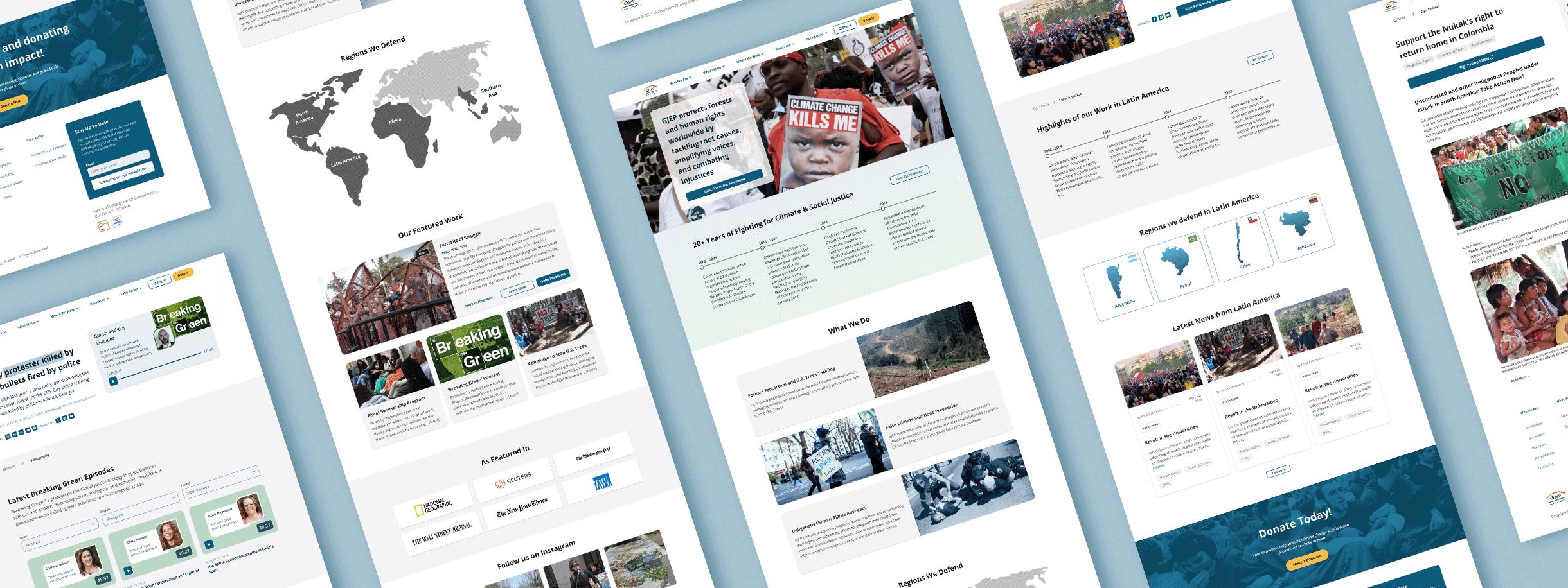
Our team aligned around a shared goal: to make GJEP’s impact visible, tangible, and easy to engage with.

We envisioned a single, unified platform that communicates the organization’s mission through clear storytelling, transparent impact data, and seamless interaction.

Research emphasized the importance of refining language, tone, and navigation so that:

a) GJEP’s long-standing advocacy work is clearly understood, and

b) visitors can easily see how their support contributes to meaningful outcomes.

From Insights to Design

By analyzing user sessions alongside our internal research, we identified several key opportunities to enhance the website experience.

We realized that clarifying and simplifying the mission statement would help a wider audience understand GJEP’s work and impact. Streamlining navigation by consolidating legacy content into a single, cohesive structure emerged as a priority to improve usability and reduce friction. Additionally, redesigning the donation flow and strengthening messaging and calls to action were essential steps to increase clarity, build trust, and guide users toward meaningful engagement with the organization.

Defining Structure & Features

Information Architecture:
We restructured the sitemap to highlight core sections such as About Us, Our Work, Get Involved, and Donate.

The Donate button was made consistently accessible across all pages to maintain visibility and encourage engagement.

Building and Testing Concepts

During the wireframing and prototyping phase, we focused on designing features that would directly support user engagement and make key actions intuitive. The donation flow was simplified with contextual calls to action, guiding users through each step with clarity. We consolidated the homepage to prominently feature GJEP’s most important campaigns and initiatives, while newsletter signup opportunities were integrated throughout the site to encourage ongoing connection. All layouts were designed with accessibility and mobile responsiveness in mind, ensuring a seamless experience for all users.

What Worked, What didn't and Why

We conducted preference testing focused on typography, imagery, and tone which were all elements identified early on as key to user engagement. These sessions guided refinements that improved how GJEP’s values and impact were communicated visually and verbally.

Reiterating

We worked iteratively throughout the project, developing multiple versions of the website that we reviewed and refined as a team of five UX designers. By exchanging ideas and feedback at each stage, we were able to simplify the navigation while still showcasing the full breadth of GJEP’s work and impact.

High Fidelity Design

To prepare for additional usability testing, we developed high-fidelity prototypes using a new visual design system centered on legibility, consistency, and emotional connection.

The updated system reduced font variation, established a clear hierarchy, and strengthened visual alignment with GJEP’s mission. Early usability testing showed that these adjustments improved user comprehension and emotional resonance with the brand.

Visual Design Development

To ensure long-term visual consistency and alignment with GJEP’s mission, we developed a comprehensive Brand Style Guide. The refreshed identity focused on a natural, earth-toned color palette, authentic photography that highlights community impact, and accessible, consistent typography to strengthen readability and emotional connection.

In parallel, we created a UI component library, including buttons, headings, and other design elements, to support the development team in modernizing the website. This library ensures consistency across fonts, styles, and interactions, providing a cohesive foundation for a more intuitive and engaging user experience.

No items found.

Key Takeaways

Through this project, we learned that clear, accessible language is essential for connecting with audiences and helping them understand the impact of their support. A unified web presence not only improves navigation but also strengthens credibility and trust, while consistent, action-oriented calls to action guide users toward meaningful engagement.

Looking ahead, the next phase will focus on validating the high-fidelity prototype through user research to ensure our design decisions achieve their intended impact. We will continue refining the visual identity, adding distinctive elements that reinforce GJEP’s unique brand personality. At the same time, we will monitor donation and engagement metrics post-launch to evaluate which features are most effective and identify opportunities for improvement. Beyond the website itself, we plan to explore additional strategies for nurturing long-term supporter relationships, including marketing initiatives and enhancing the organization’s presence across social media channels.

Take me back